MIDAS 2026
Companion website for the MIDAS 2026 workshop.
A convolution slides a small filter over an image and records how strongly the filter matches at each spot. The result is a heatmap of matches.
- Draw a shape in the input grid with your mouse.
- Pick a filter, such as an edge or blur filter.
- Read the output heatmap. Bright cells are where the filter matches.
- Hover a cell in the output to see the 3×3 patch and the multiply-and-add that produced it.
Even More
A CNN learns these filters instead of using fixed ones. Early layers learn edge and color filters. Later layers combine them into textures, shapes, and objects.
The same operation runs on any grid of numbers, not only images.
A polynomial of the chosen degree is fit to the black training points by least squares. The gray points are held-out test data from the same function.
- Start at degree 1. A straight line underfits a curved signal.
- Raise the degree. The curve fits the training points more closely.
- Past a certain degree, training error keeps dropping but test error rises sharply. This is overfitting.
- Drag the black points to change the fit. Change the true shape to see which degree fits best.
Even More
The right-hand plot shows training error and test error at every degree. The best degree is the one with the lowest test error, not the lowest training error.
A model that fits the training points perfectly has usually memorized noise. It does worse on new data.
A decision tree splits the plane with straight, axis-aligned cuts, one at a time. Depth 1 is a single cut. More depth means smaller regions.
- Set the Max depth slider to 1. The single cut is too coarse.
- Raise the depth and watch the regions get smaller.
- At high depth the tree draws a small region around individual points. This is overfitting.
- Change the Data shape. Trees handle blobs and XOR well. They struggle with spirals and rings.
Even More
The accuracy plot tracks the tree as depth increases. Training accuracy climbs toward 100 percent because a deep tree can fit every training point.
Test accuracy usually rises, peaks, then falls. Past the peak the tree is fitting noise. Choose the depth at the test peak.
Gradient boosting trains many shallow trees in sequence. Each tree corrects what the current set of trees still gets wrong, and is added with a small learning rate. This demo follows the XGBoost method.
- Set rounds to 1. The boundary is a single shallow tree.
- Raise rounds. Each new tree adds a small correction and the boundary sharpens.
- Lower the learning rate. You will need more rounds, but the model usually generalizes better.
- Set subsample to 0.5. Each tree now sees half the points, which reduces variance.
- Try Spiral or Rings. Boosting follows curves that a single tree cannot fit without overfitting.
Even More
Each tree is fit to the gradient of the loss, which points in the direction to move each point. XGBoost also uses the Hessian, a measure of confidence, to choose the step inside each leaf. It adds L2 regularization on leaf values and row subsampling.
The right plot shows training and test log-loss per round. The orange line marks the current round. The test curve often falls, then rises. The rise is overfitting.
XGBoost, LightGBM, and CatBoost are the standard choice for tabular data.
Random Forest, the parallel alternative
Random forests and gradient boosting both build ensembles of decision trees, but they combine those trees in different ways. Gradient boosting trains trees one after another. Each new tree is trained to correct the errors made by the current ensemble, so the trees work together to improve the model. Random forests train many trees independently, often in parallel. Each tree sees a different bootstrap sample of the data, and each split considers only a random subset of features. For classification, the trees vote. For regression, their predictions are averaged. As a result, gradient boosting mainly reduces bias by building progressively better models, while random forests mainly reduce variance by averaging many different trees. An additional advantage of random forests is that they provide an out-of-bag (OOB) estimate of performance without requiring a separate validation set. The OOB estimate is an internal measure of model accuracy that uses the training examples not sampled for a given tree.
Before training anything, split the data into train and test. The model only ever sees the train points. The test points are locked away. After training we score the model on the held-out test set. This gives an unbiased estimate of how it will do on truly new data. The split is decided once and never moved. If you tune your hyperparameters by looking at test-set numbers, you are cheating, and your reported accuracy is optimistic. Below, solid markers are train and hollow rings are test.
○ hollow is test. The model never sees these. We only use them to score it at the end.
For each tree in the forest, draw N samples with replacement from the training set, where N is the number of training points. Because we draw with replacement, about 63% of unique points end up in bag for any given tree. The remaining 37% are out-of-bag (OOB) and are never seen by that tree. The OOB points act as a built-in validation set. For each training point, we average the predictions of just the trees that did not see it, and the result is an unbiased accuracy estimate. This gives validation with no separate hold-out needed, though the hold-out is still worth keeping for a final check. Drag the slider to move through trees and watch each one's bootstrap change.
● solid is in-bag for this tree.
○ hollow is out-of-bag. This tree was never trained on it.
Each tree is grown deep on its bootstrap sample and may consider only a random subset of features at each split. On its own, a single deep tree overfits. Its decision regions are jagged and depend heavily on which 63% it happened to see. But because each tree was trained on different data and made decisions using different features, their errors are uncorrelated. Averaging their probability predictions cancels the noise. Six example trees are shown below, with the averaged forest boundary on the right.
As we add more trees, both the OOB and held-out test accuracy climb and then plateau. The OOB curve tracks the test curve so closely that practitioners often use it as the primary validation signal, saving the held-out set for a single final number. The forest barely overfits with more trees. Adding trees only refines the average. It does not make any single tree more aggressive. Contrast this with boosting above, where more rounds means more aggressive fitting and eventual overfitting. The dashed gray line is the average single-tree accuracy. The gap between it and the solid lines is the variance reduction the ensemble buys you.
Overfitting with our penguin data. Pick a target. Pick which features the model can use. Pick a model. Then move the complexity slider and watch the training and test accuracy curves.
- Predict species from the four body measurements with a Decision Tree.
- Drag max_depth from 1 to 15. Training accuracy reaches 100 percent. Test accuracy peaks near depth 3 to 5, then falls.
- Reshuffle the split a few times. Does the model accuracy change each time?
- Increase the test fraction to 0.5 and reshuffle a few more times. It should be more consistent.
Even More
Training accuracy almost always climbs with complexity, because the model gets better at fitting data it has already seen. Test accuracy is the one that matters.
When test accuracy falls while training accuracy keeps rising, the model is learning noise specific to the training set. That noise does not transfer to new penguins. Random forests keep the gap small, which is why ensembles usually beat a single tree on tabular data.
Three models see the same data and draw different decision boundaries. Logistic regression splits with a straight line. k-NN votes among the k nearest points. A decision tree stacks rectangular splits.
- Choose Moons, Rings, or XOR.
- Cycle through the three models. The straight line fails on data that are not linearly separable.
- Raise k to make the k-NN boundary smoother.
- Raise the tree depth to see it fit noise.
Even More
The bars on the right compare the three models' test accuracy on the current data. Which model wins depends on the shape of the data, not on which model is best in general. Match the model to the structure you can see.
K-Means assigns each point to its nearest centroid, then moves each centroid to the mean of its points. It repeats until nothing moves.
- Load Round blobs with K=3 and click Run. The clusters converge cleanly.
- Try Moons or Rings with K=2. K-Means assumes round, similar-size clusters and splits these shapes badly.
- Try Uniform noise. K-Means still returns K groups, even though there is no real structure.
- Click the canvas to add your own points.
Even More
The inertia plot on the right is the loss. It is the sum of squared distances from each point to its nearest centroid. It decreases at every step.
Low inertia does not mean the clusters are real. On uniform noise the algorithm still reports a result. Confirm that structure exists before trusting the groups.
Six unsupervised methods run on the same real penguin data. Three clustering methods (K-Means, Hierarchical, DBSCAN) split the data into groups. Three dimension-reduction methods (PCA, t-SNE, UMAP) project the four features down to two so the structure is visible.
- Start on K-Means with K=3. The three clusters roughly match the three species. Marker shapes are circle, triangle, and square for Adelie, Chinstrap, and Gentoo.
- Switch to DBSCAN and move the eps slider. Small eps marks everything as noise. Large eps merges all points into one group. A middle value separates the species.
- Switch to t-SNE or UMAP. The species separate into distinct groups.
- Switch to PCA. The projection is linear, so the same data show less separation. PCA has no parameters to set.
Even More
All methods run live in your browser on standardized (z-scored) features.
t-SNE and UMAP show that the species are already separable without labels. What a supervised model learns to name, these methods can reveal on their own. PCA is faster and has no parameters, but a linear projection keeps the groups closer together.
Penguin sizes & species: a notebook
The Palmer Penguins dataset holds 344 measurements of three penguin species (Adelie, Chinstrap, Gentoo). Dr. Kristen Gorman collected them near Palmer Station, Antarctica, between 2007 and 2009.
This tab runs the same data through a set of models, from the simplest to the most flexible. The data below are embedded directly in this HTML. There are 342 rows, after dropping 2 rows with missing numeric fields.
Source: Horst AM, Hill AP, Gorman KB (2020). palmerpenguins: Palmer Archipelago (Antarctica) penguin data. R package version 0.1.0. allisonhorst.github.io/palmerpenguins · GitHub allisonhorst/palmerpenguins
Original data: Gorman KB, Williams TD, Fraser WR (2014). Ecological sexual dimorphism and environmental variability within a community of Antarctic penguins (genus Pygoscelis). PLoS ONE 9(3), e90081. doi:10.1371/journal.pone.0090081
import pandas as pd

penguins = pd.read_csv('penguins.csv').dropna()
penguins.shape, penguins['species'].value_counts().to_dict()
penguins.head(8)- Find a set of traits that makes it difficult to tell the species apart.
- Then find a set of traits that makes the species distinction obvious.
import matplotlib.pyplot as plt

for species, group in penguins.groupby('species'):
    plt.scatter(group[x_feat], group[y_feat], label=species)
plt.legend(); plt.xlabel(x_feat); plt.ylabel(y_feat); plt.show()
- Find the input variable that gives the strongest association with body mass.
- Do you think we need to log-transform the data first?
from sklearn.linear_model import LinearRegression

X = penguins[[x_feat]]
y = penguins['body_mass_g']

model = LinearRegression().fit(X, y)
print(f"slope: {model.coef_[0]:.2f} g per unit")
print(f"intercept: {model.intercept_:.0f} g")
print(f"R²: {model.score(X, y):.3f}")
- Set the target to Gentoo vs others.
- Set the two features to body_mass_g and bill_depth_mm. This yields a very clean separation.
from sklearn.linear_model import LogisticRegression

X = penguins[[x_feat, y_feat]]
y = (penguins['species'] == target).astype(int)

model = LogisticRegression().fit(X, y)
model.score(X, y)
from sklearn.neighbors import KNeighborsClassifier
from sklearn.preprocessing import StandardScaler
from sklearn.pipeline import make_pipeline

X = penguins[[x_feat, y_feat]]
y = penguins['species']

model = make_pipeline(StandardScaler(), KNeighborsClassifier(n_neighbors=k))
model.fit(X, y).score(X, y)
from sklearn.tree import DecisionTreeClassifier, export_text

model = DecisionTreeClassifier(max_depth=depth).fit(X, y)
print(export_text(model, feature_names=[x_feat, y_feat]))
from sklearn.cluster import KMeans
from sklearn.preprocessing import StandardScaler

X = StandardScaler().fit_transform(penguins[[x_feat, y_feat]])
clusters = KMeans(n_clusters=K, n_init=10).fit_predict(X)
This is a simple approach to object detection. First, we decide what we want the model to find. We want penguins. Next, a person manually draws a bounding box around every penguin in every training image. Here, you drew 1,147 boxes across 297 photos.
Those labeled examples become the training data. The model learns to predict the location of those boxes in new images it has never seen before.
We trained two YOLOv11n object detectors using the same 238 training images and 59 validation images. One detector was trained with a single penguin class. The other was trained to distinguish the three species, Adélie, Chinstrap, and Gentoo. Everything else about the training process was identical.
Later on, we will look at DINOv2, which takes a very different approach. Instead of learning from manually labeled examples, it learns patterns directly from large collections of unlabeled images. That gives us a nice preview of the difference between supervised and unsupervised learning.
The figures on this tab are pre-rendered images. You can step through the galleries and read the charts.
Even More
All figures are pre-rendered by scripts/make_yolo_demos.py and stored under demos/YOLO/.
Training and export code lives in scripts/yolo_train.py and scripts/yolo_export.py.
1 · Labels are the bottleneck
YOLO is supervised. It can only learn what you tell it. So somebody has to draw rectangles. Below are three sample images we labeled, shown twice. The top row uses three species classes. The bottom row uses a single penguin or no penguin class. The boxes are identical in both rows. The only difference is the label we asked the annotator to write inside each box.
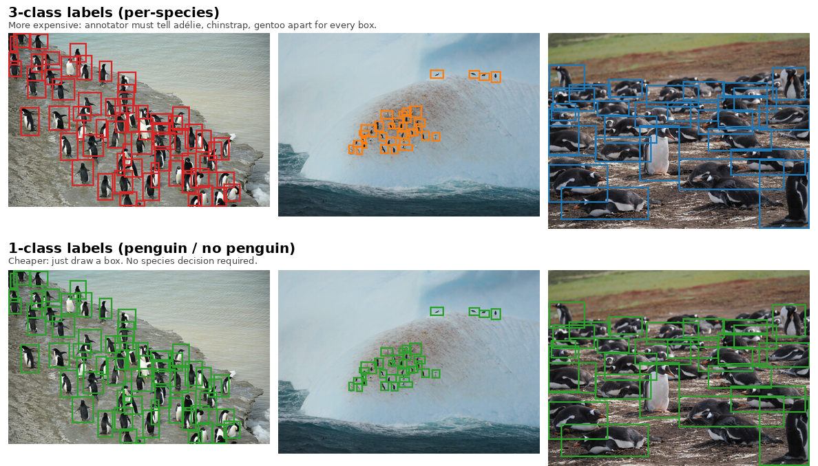
Single-class labels are cheaper to produce. The annotator only has to find the object, not identify it. For dense flock photos, telling species apart for every bird is most of the work. Whether that extra effort is worth it depends on the downstream task. If you only want population counts, the green single-class boxes are enough.
What the training set looks like
These are a few labeled training images per species. The 3-class view shows the species color. The 1-class view shows the same boxes in green.
- Use the dropdown to filter by species.
- Step through the images with the arrows.
- Compare the left and right galleries. The boxes match. Only the label color and text differ.
2 · What's actually inside YOLOv11
Every figure in this section comes from this trained model. It is the same 2.59 million parameter YOLOv11n we used to label your chinstraps.
Even More
Inspection code lives in scripts/inspect_yolo.py.
The architecture description follows Khanam and Hussain (2024), YOLOv11: An Overview of the Key Architectural Enhancements [arXiv:2410.17725].
The 24-layer model, end to end
YOLOv11 has three parts. The backbone extracts features at multiple scales. The neck mixes those scales together. The head predicts boxes. Our trained model is 24 layers. The table below shows the output shape after each layer (channels by height by width) for a 640×640 input.
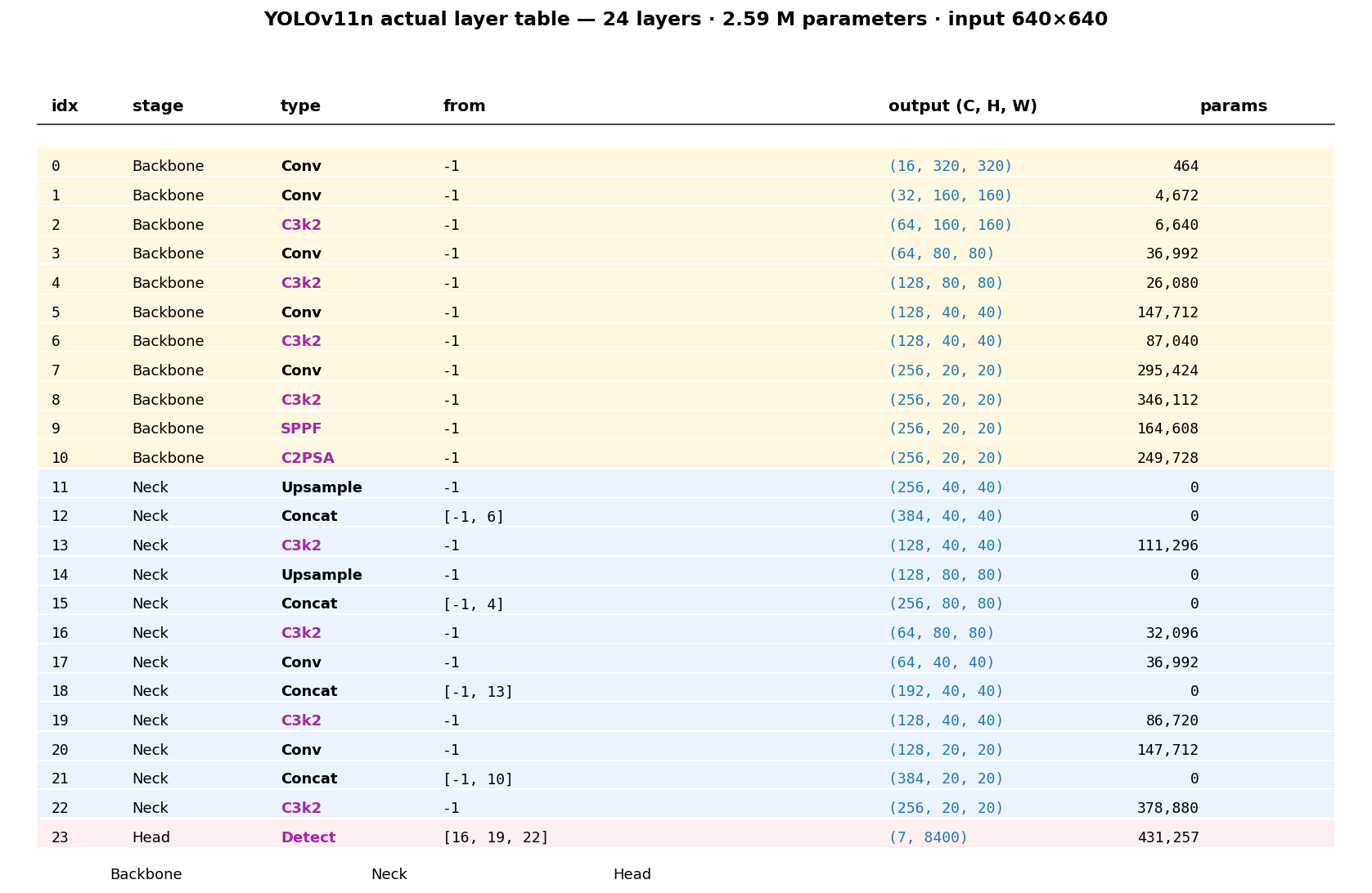
Three module types are specific to YOLOv11.
- C3k2 is Cross Stage Partial with kernel 2. It is the main building block. It replaces the C2f block from YOLOv8 by swapping one large convolution for two smaller kernel-2 convolutions. This keeps the same expressive power with less compute and runs faster on a GPU. C3k2 appears in both the backbone and the neck.
- SPPF is Spatial Pyramid Pooling Fast. It applies three max-pools at different strides in sequence and concatenates them. This is a cheap way to widen the receptive field at the deepest backbone stage, so the network sees big penguins and small penguins in one tensor.
- C2PSA is Cross-Stage Partial with Parallel Spatial Attention. This is the main new addition in YOLOv11. It sits right after SPPF. It applies multi-head self-attention across space, so the deepest features can focus on object regions before the neck mixes them downward.
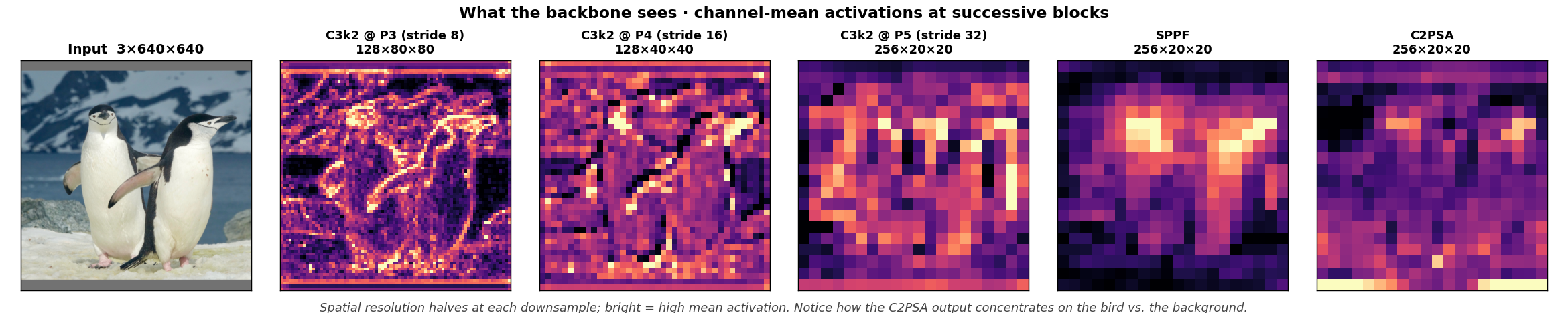
Features at every stage, so the model is not a black box
This shows the channel-mean activations after the major backbone blocks. Resolution halves at each downsample, from 640 to 80 to 40 to 20. Notice how the activations concentrate more and more onto the bird and away from the rocky background.
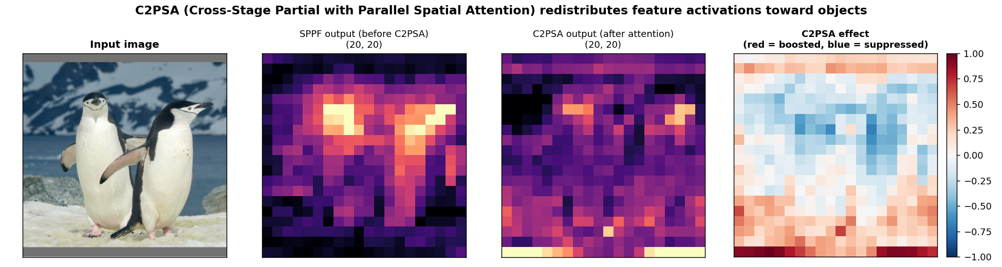
What does C2PSA actually do? Compare the activation map going in (after SPPF) with the map coming out. In the right panel, red regions are where attention boosted the activation. Blue regions are where it suppressed the activation. The pattern shows the model concentrating on the foreground.
Three detection scales in parallel
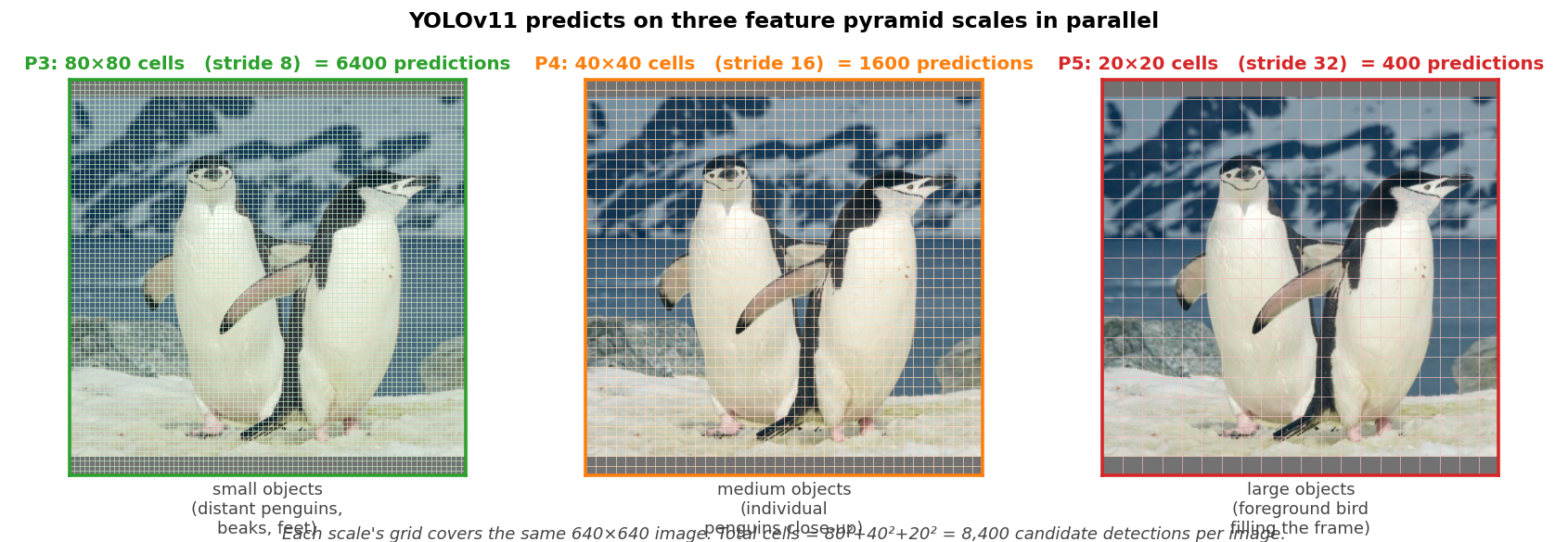
Detection happens at three feature-pyramid levels at once, one each for small, medium, and large objects. The Detect layer (number 23) takes inputs from layer 16 (stride 8), layer 19 (stride 16), and layer 22 (stride 32). For a 640×640 image this gives 80×80, 40×40, and 20×20 grids. That adds up to 6,400 plus 1,600 plus 400, for 8,400 candidate predictions.
What each cell predicts, anchor-free with DFL
Older YOLO models picked anchor templates and predicted offsets (tx, ty, tw, th) from each. YOLOv8 and later, including v11, are anchor-free. There are no priors. The bounding box is defined as four distances l, t, r, b from the cell center to the four edges of the box.
The head does not simply regress those four numbers. It uses Distribution Focal Loss (DFL). For each of the four edges, the head predicts a probability distribution over reg_max = 16 discrete distance bins. The box edge is the expected value of that distribution.
Here is the distribution our trained model produces for one cell on a chinstrap photo. The four bar plots are the predicted distance distributions for the four edges. The green box is the bounding box you get by taking each distribution's expected value. Peaked, low-variance distributions mean the model is confident. Ambiguous edges, such as partially occluded ones, produce wider distributions.
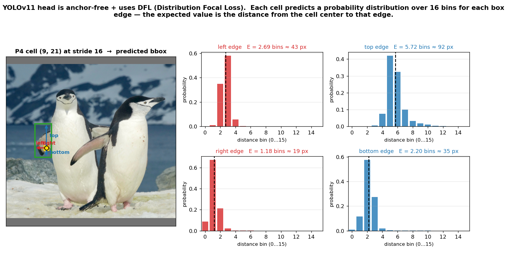
So per cell, per detection scale, the model outputs 4 × reg_max + num_classes values. For our 3-class detector that is 4×16 plus 3, which is 67 floats per cell. There are no anchors, no separate objectness logit (it is folded into the class scores through focal loss), and no width or height regression. There are just four edge distributions and class scores.
From dense candidates to a few final boxes
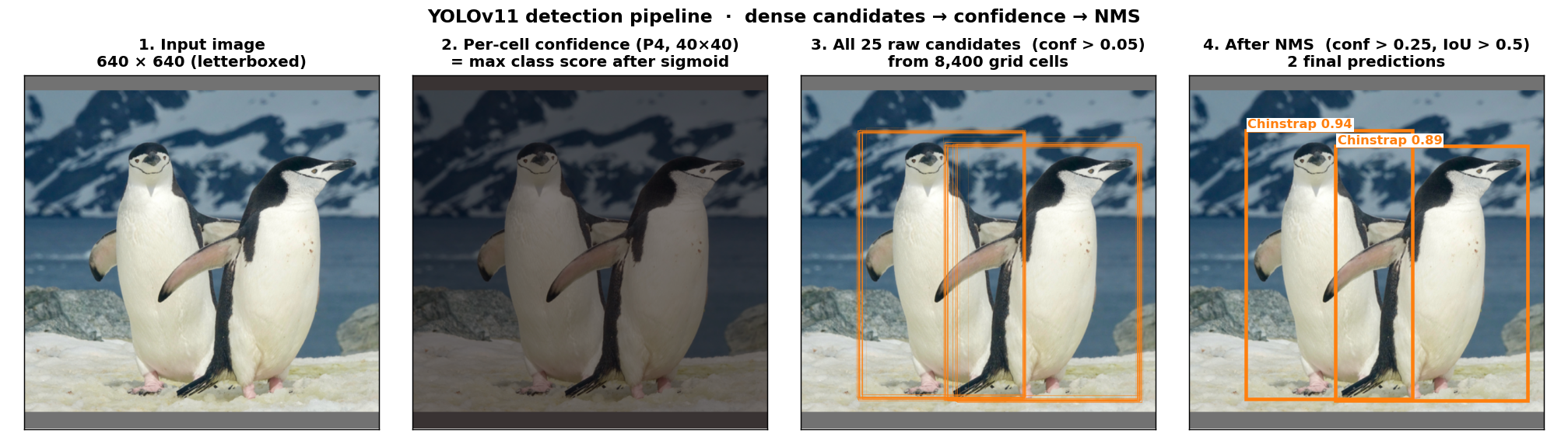
YOLOv11 emits all 8,400 candidates in parallel. Almost all of them are dim. Only cells whose receptive field actually contains an object raise their confidence. The pipeline below shows this on a chinstrap photo. First the per-cell confidence heatmap at P4. Then every raw box above confidence 0.05, which is 14 here, all drawn faintly so the clustering is visible. Then the one box that survives NMS at confidence 0.25 and IoU 0.5.
3 · Training dynamics. What to watch in the curves
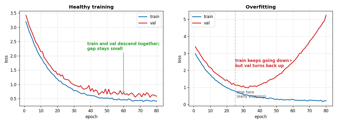
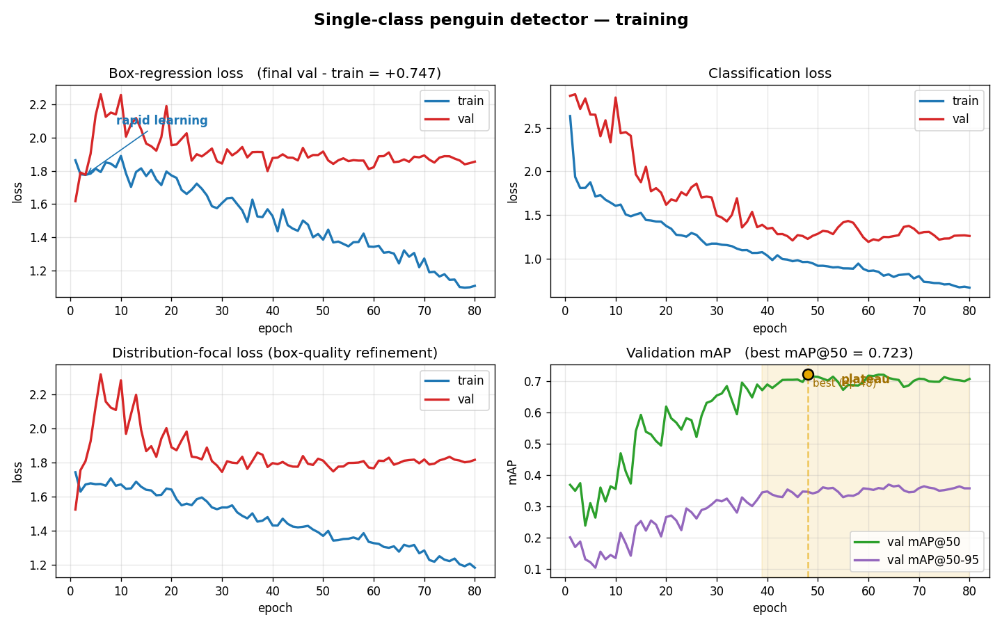
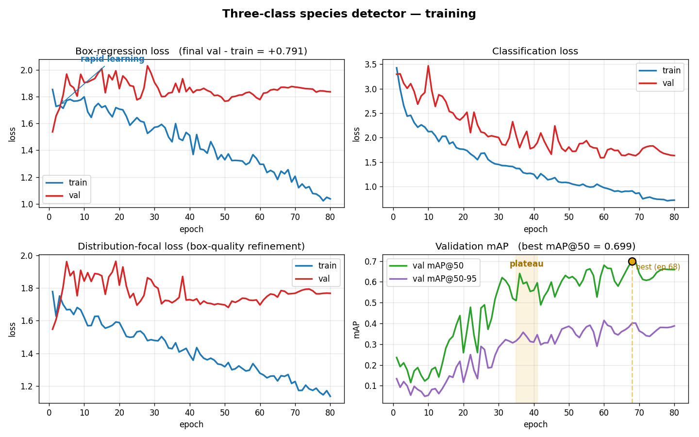
Once the data are set up, the main things to watch during training are the loss curves and the validation mAP. Three patterns tell you whether to stop, keep going, or worry.
- Rapid descent in the first 10 epochs or so is the model picking up the easy signal. Both the training loss and the validation loss should drop together.
- Plateau means the easy signal is used up. Training loss flattens and validation mAP stops climbing. This is usually a fine place to stop.
- Overfitting shows up when training loss keeps falling while validation loss starts rising and validation mAP turns back down. The gap between the training and validation curves widens. If your run ever looks like the right plot below, your best epoch is somewhere on the way down, so stop earlier next time.
Single-class detector, actual training run
This is 80 epochs of YOLOv11n on 238 training images. The box-regression and DFL losses drop quickly, plateau by about epoch 30, and then wander noisily, which is typical for a small dataset. Validation mAP@50 peaks at 0.712 near epoch 60 and stays roughly there. There is no real overfitting, but also no further gains. This run was about as good as YOLOv11n gets without more data or augmentation.
Three-class detector, actual training run
Same backbone, same epochs, same data. Now the model must also identify each penguin. The classification loss is the new component. Validation mAP@50 peaks at 0.681, slightly lower than the 1-class run because the task is harder. But mAP@50-95 is higher at 0.414. Having to tell species apart forces tighter bounding boxes.
4 · Predictions on held-out images
All images below are from the validation split, so the model never saw them during training. Each image is overlaid with the boxes described in the legend.
The gray banner shows counts. GT is ground-truth boxes in the image. TP is correctly predicted. FP is falsely predicted. FN is missed. The confidence score sits next to each prediction.
Look at the gentoo images in particular. Those photos used a mix of manual labels and machine-assisted labels, because the 3-class model was started from a partially trained single-class detector. The dense crowd shots are still hard. The model often fails on partially occluded birds and merges adjacent ones. This is exactly why people pay annotators. Cleaning up the gentoo subset by hand would almost certainly raise gentoo mAP by 10 points or more.
5 · Side-by-side
This shows both models on both metrics, using the same data.
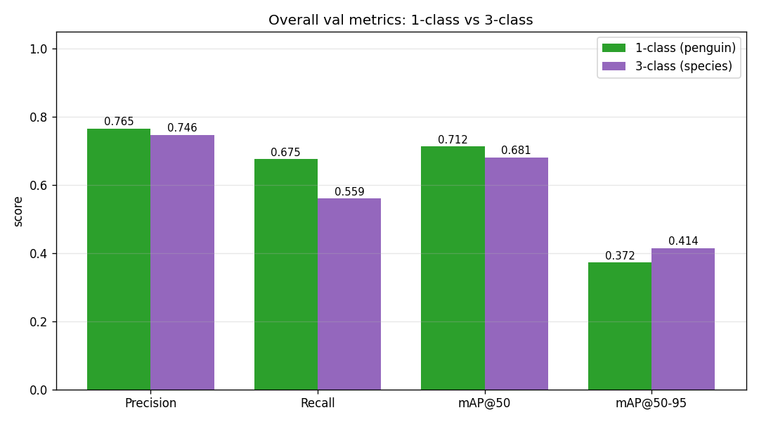
The 1-class detector wins at mAP@50 by 3 points. That is expected, because the task is genuinely easier. But the 3-class detector wins at the stricter mAP@50-95 by 4 points. The species supervision forces it to draw tighter, more discriminative boxes. Adding species labels does not hurt detection.
Per-species breakdown (3-class model)
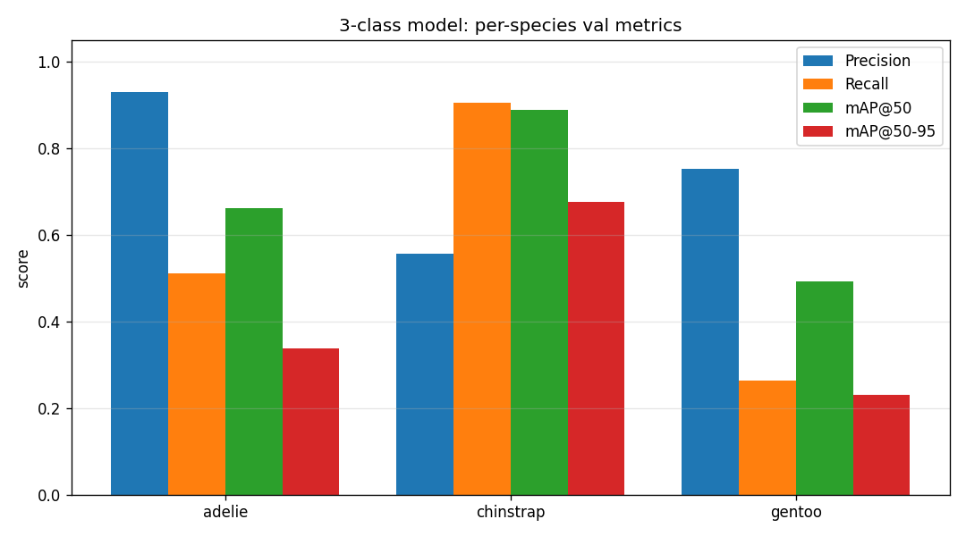
Chinstrap is by far the strongest class at mAP@50 = 0.89, even though it has the fewest training boxes at 264. The distinctive black chin-strap marking is visually unique, so the model picks it up easily. Gentoo is the weakest at mAP@50 = 0.49. Most gentoo boxes were auto-labeled by a half-trained detector, so the training signal is noisier than the manual Adélie and chinstrap labels.
A fair comparison, can the 3-class model find penguins?
Here is a fairer test. Take the 3-class model's predictions and ignore the species. Just ask whether it put a box where there was a penguin. On that comparison, the two models are within 1 point.
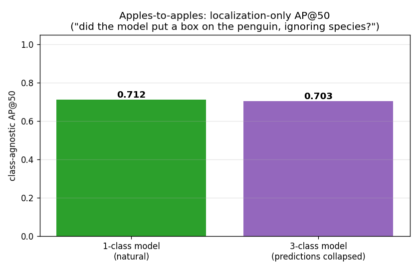
They are practically identical. So the 3-class model is as good a detector as the 1-class model, and it also tells you the species. The only real cost of the 3-class run was the extra labeling effort up front.
6 · What YOLO can't do (and DINOv2 can)
Everything above required someone to draw 1147 boxes. The model never learns anything we did not directly teach it. If you wanted to find seals in these photos tomorrow, you would start over. You would relabel and retrain. The next tab (DINOv2) takes the opposite approach. It is a model trained on 142 million unlabeled images that already knows what visual sameness means. From that foundation you can do classification, retrieval, and segmentation with little or no task-specific labeling. YOLO fits the case where you know exactly what you want and have the budget to label it. DINOv2 fits the case where you do not know yet and would rather not label everything.
DINOv2 is a self-supervised vision transformer from Meta AI. The demos below run it on 300 penguin photos from iNaturalist. There are three species, Adélie, Chinstrap, and Gentoo, with 100 photos each. The point is that DINOv2 never saw species labels, yet its features already separate the species.
Even More
DINOv2 was trained on about 142M images with no labels. Its only objective was that two augmented crops of the same photo should produce similar features. The resulting features are good enough that you can do classification, retrieval, and even segmentation on top of them with very little task-specific work.
These demos use ViT-S/14, the smallest variant, with about 21M parameters. The model card is facebook/dinov2-small on Hugging Face.
Even More
Inference is pre-computed. This page shows cached outputs from scripts/run_dinov2.py and scripts/wsss_with_dino.py so it can be served as a static site.
1 · Embeddings · what does DINOv2 know about these photos?
This section looks at the features DINOv2 produces for each photo. We check whether those features are already organized by species.
Global structure · UMAP of the CLS token
Each photo passes through DINOv2 and we keep the CLS token. This is one 384-dimensional vector that summarizes the whole image. UMAP projects all 300 vectors down to 2D so we can plot them.
No species labels were used, either during DINOv2 training or here in UMAP. The colors are added only at the end so you can check the structure. The species form clean clusters, which means DINOv2 already organizes its representation by visual identity.
Click any point to see the photo behind it. Hover for a quick highlight.
- Look at whether the three colors form three separate clusters.
- Click a point in the middle of a cluster and note the photo.
- Click a point near a boundary between two colors. These outliers are often borderline or poor-quality photos.
Cosine similarity between species
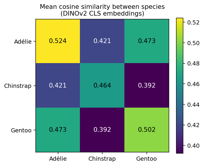
This grid shows the mean cosine similarity of CLS embeddings within and between species. The diagonal is highest, because a penguin is most similar to others of its own species. Chinstrap and Gentoo are the least similar pair, and they look the most distinct visually too.
Patch tokens · DINOv2 sees parts, not just whole images
Besides the CLS token, every image produces a grid of patch tokens. We run PCA on those tokens and map the first three components to red, green, and blue. Patches with similar features end up the same color. Parts emerge on their own. The penguin body, the head, and the background all separate into different components, even though DINOv2 was never told which part is foreground.
- Step through the gallery with the arrows.
- Filter by species and see whether the same part gets the same color across photos.
- Check whether the penguin is a different color from the background.
Even More
The patch grid is 37×37 at a 518-pixel input.
Nearest-neighbor retrieval
For each species we pick a query photo at random. Then we find the 5 most similar photos by cosine similarity in CLS space. The retrieved neighbors are all the right species, even though the model was never told what a species is.
This is the frozen feature extractor workflow. You can do useful tasks without ever training a classifier.
- Step through the three query photos.
- For each query, check whether all 5 neighbors match the species of the query.
2 · Weakly supervised segmentation · clicks → pixel masks
Labeling every pixel of a segmentation mask is slow. Drawing bounding boxes is faster. Clicking the center of each subject is faster still. This section asks a question. Given only one click at the center of each penguin, can we train a real segmentation model?
DINOv2 patch features are already consistent at the object level. We treat each center click as a seed. We sample its DINOv2 patch feature, then mark every other patch with similar features as foreground. That gives a usable rough mask. We then train a small UNet on those rough masks, and we have a working segmentation model from clicks alone.
Even More
The center points are the centroids of bounding boxes, one click per penguin. The dataset has 123 annotated images with 561 center clicks in total, stored in data/annotations.db.
From clicks to pseudo-masks · cumulative seed bank
A single center click sits in the middle of the body. Similarity to that one point tends to miss parts that look different, such as the beak, flippers, and feet.
Instead we pool every center feature from every image into one seed bank of about 561 vectors. Each patch is scored by the mean of its top 20 cosine similarities to the bank. A flipper in this photo can now be matched by a click that landed on a flipper in some other photo. We then limit support to the padded union of the bounding boxes so the mask never spreads into the background.
- Step through the gallery.
- Check whether the mask covers the beak, flippers, and feet, not just the body.
- Look for places where the mask spreads past the penguin outline.
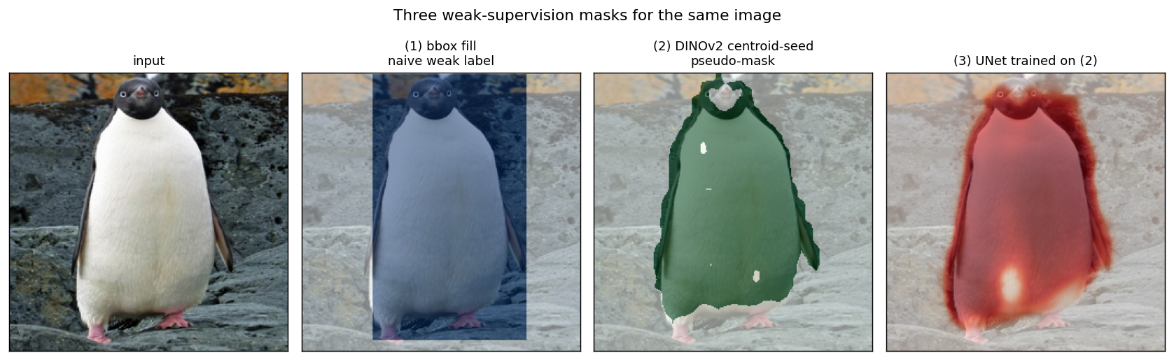
Three weak-supervision masks side by side
This shows the same input photo with three ways of turning the box annotation into a pixel mask. The first fills the box rectangle. The second is the DINOv2 center-seed rough mask. The third is the UNet trained on the second. The first spreads well into the background. The second and third follow the penguin outline closely.
Training a UNet on the pseudo-masks
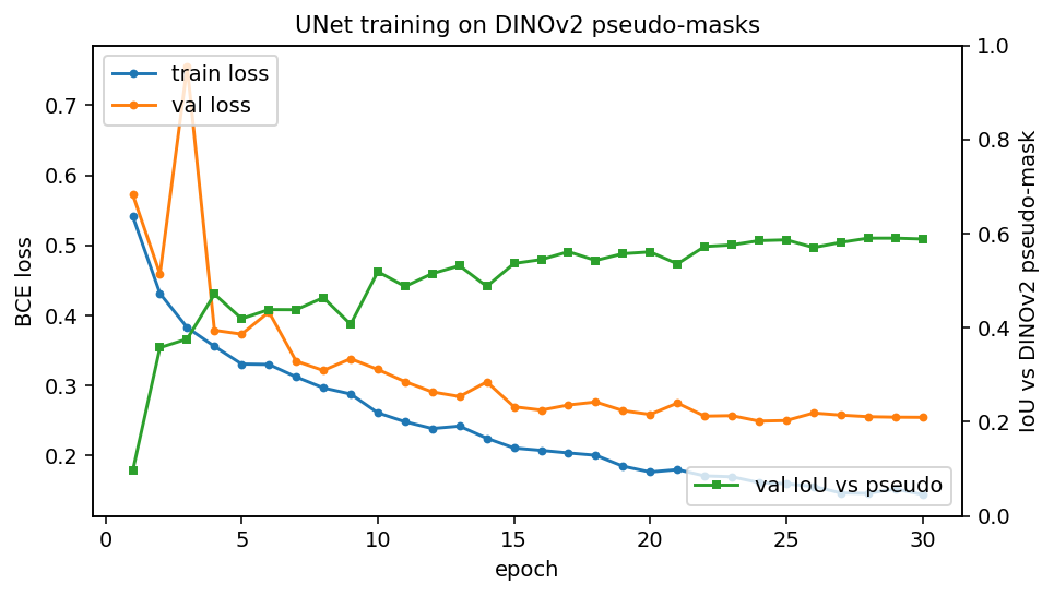
We train a small UNet on the rough masks. The green IoU curve is measured against the rough masks themselves, and it climbs to about 0.59. This tells us the UNet is learning to reproduce the rough masks.
A real test set with human pixel labels would tell us how close the rough masks are to the truth. For this demo the training and validation curves are enough to show that learning is happening.
Even More
The UNet has 3.35M parameters. It was trained with BCEWithLogits loss, AdamW, and a cosine learning rate schedule for 30 epochs on the 99-image training split.
UNet predictions on held-out images
These are validation photos the UNet did not train on. Each row shows the input photo, the center clicks a human gave us, the DINOv2 rough mask used as the training target, and the UNet prediction on this new photo.
The UNet never had access to DINOv2. It saw only RGB pixels, yet it learned to produce real penguin outlines from clicks alone.
- Step through the rows.
- Compare the UNet prediction in the last column against the rough mask in the third column.
- Note where the prediction is cleaner or worse than its training target.
SAM2 (Segment Anything 2, Meta AI) is a promptable segmenter. You give it a prompt and it returns a per-pixel mask. A prompt can be a point click, a bounding box, or a previous mask. Below we run SAM2.1 hiera_tiny (~38M params) on the same penguin photos.
Even More
SAM2 was trained on SA-1B, about 11M images and about 1.1B masks. The goal was to segment anything across domains, not just a fixed list of classes.
The model card is facebook/sam2.1-hiera-tiny on Hugging Face.
Every figure below is pre-computed. Step through the galleries and compare the masks.
Even More
Outputs come from scripts/run_sam2.py and scripts/finetune_sam2.py. They use the bbox annotations in data/annotations.db, which holds 297 images and 1147 boxes.
1 · Segment everything with no prompt
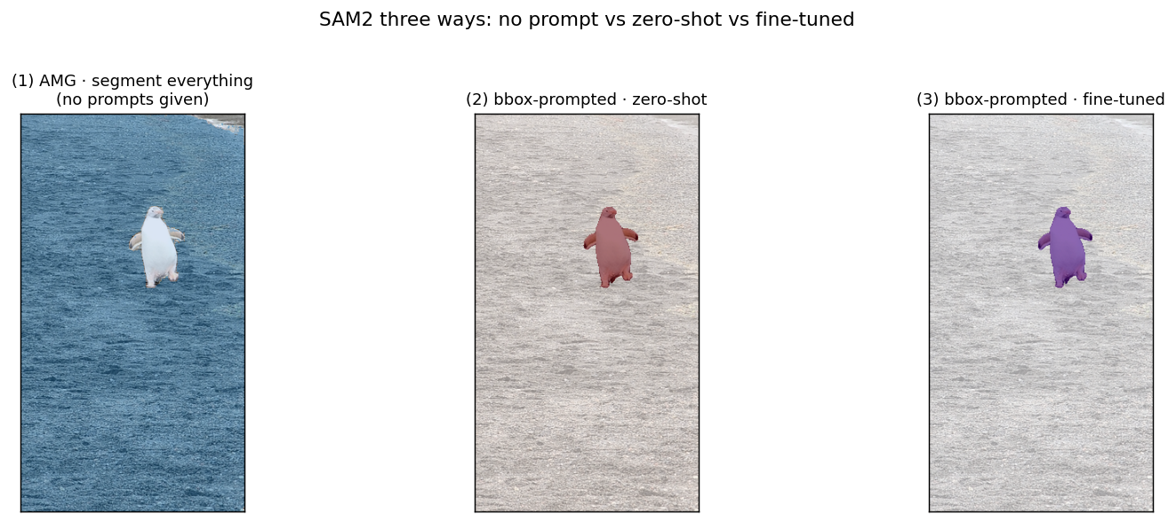
With no prompt at all, SAM2's automatic mask generator (AMG) covers the image with a grid of point prompts. It then returns a mask for each region it finds. The result is a per-instance split of the whole scene. That includes penguins, rocks, sky, snow patches, and beach.
- Step through the gallery and find every region SAM2 carved out.
- Count how many masks land on the penguins versus the background.
- Filter by species and see whether crowded scenes get more masks.
Even More
AMG is the demo that shows SAM2 finding objects on its own. It is also expensive. Each image uses a 24×24 grid, which is 576 candidate points.
AMG tends to over-segment. You usually have to filter or merge the masks afterward.
2 · Prompt SAM2 with our boxes
Here is the more practical workflow. We feed SAM2 the bounding boxes we already drew during annotation. For each box, SAM2 returns one high-quality mask. The box alone tells SAM2 what we want. No fine-tuning and no per-class classifier are needed.
- Step through the gallery and check that each mask fits one penguin.
- Compare these clean silhouettes to the crowded output from section 1.
Even More
Drawing a mask by hand takes a person about 10 minutes of polygon clicking per penguin. SAM2 produces the same result from a single box.
3 · Fine-tuning SAM2 with our box labels
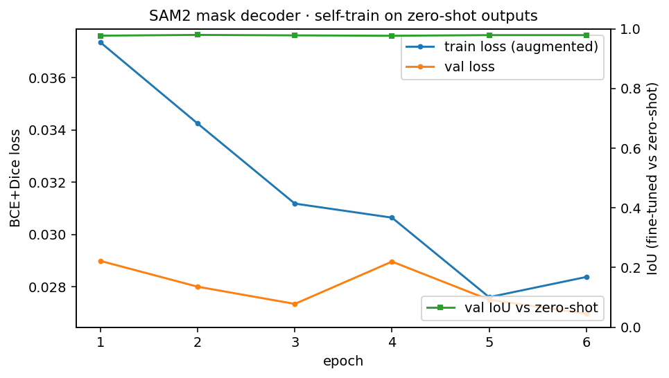
SAM2's box-prompted masks are already excellent, so what does fine-tuning add? We ran a self-training experiment to find out. The training curve and comparisons are below.
The short answer is that the model barely changes. Its masks match the zero-shot masks almost exactly. The gains come from teaching the model to ignore changes in lighting and orientation.
Even More
In self-training, SAM2's own zero-shot outputs become the targets. The original boxes stay as the input prompts. We freeze the image encoder (340M params) and train only the prompt encoder and mask decoder (about 4.2M params).
Each epoch we augment the image with a random horizontal flip and color jitter. The model still has to predict the same mask. So it learns to be invariant to lighting and orientation while keeping SAM2's mask quality.
Because the targets are SAM2's own predictions, the outputs converge to nearly identical masks. The IoU against zero-shot is about 0.98. The training curve is mainly a check that the loop works. A real gain in specialization would need independent ground-truth labels rather than self-distillation.
Training curve
The loss falls fast and then flattens. This confirms the training loop runs correctly.
Three ways to run SAM2, side by side
This shows one image under three settings. The first is AMG with no prompt, which finds whatever stands out. The second is box-prompted zero-shot, which gives a clean silhouette from the box. The third is box-prompted fine-tuned, which looks nearly identical to zero-shot.
Fine-tuned predictions on held-out images
These are validation images the model did not train on. Each row shows the input, the boxes the user drew, the zero-shot mask, and the fine-tuned mask.
- Step through the gallery and compare the zero-shot mask to the fine-tuned mask in each row.
- Filter to chinstrap and look at the close-ups. The small differences show up there.
Even More
On most images the two masks are identical. The differences are subtle. The fine-tuned mask has slightly tighter edges and more confident coverage of feet and flippers.
These differences are clearest on the chinstrap close-ups, where SAM2 has to choose between the cap and the body.
"Why is this image species A and not species B?" The DINOv2 tab showed that the species form clean blobs in the feature space. Here we train a 3-way logistic regression on top of frozen DINOv2 CLS embeddings. Then we use the classifier's own weights to find which spatial regions push the prediction toward one class over another. This is the closed-form version of GradCAM. When the head is linear, no backward pass is needed.
The classifier reaches 100% accuracy on the 300 training images and 91.3% ± 2.7% in 5-fold cross-validation. The species are clearly separable even with one linear layer.
1 · How the attribution works
Each image becomes one CLS vector v of length 384. The logistic-regression head has a weight matrix W of shape (3 classes × 384) and a bias. The score for class c is v · Wc + bc. To answer "why class A and not class B?", we look at the score difference v · (WA − WB).
The CLS vector aggregates the whole image into one number. But each image also gives a 37×37 grid of patch tokens in the same 384-dim space. Project each patch through the direction (WA − WB) and you get a signed score for every patch. Red means this region's features push toward A. Blue means it pushes toward B. Neutral means no opinion.
Even More
The heatmap is normalized per image to the 95th percentile of the absolute scores. This makes brightness comparable across images.
You will often see red land on more than the bird. The model also leans on the typical environment, such as snow versus ocean versus rocky beach. This is a real finding, not a bug. A linear head on a frozen ImageNet-scale backbone will use any correlated signal it can find.
Figures pre-computed by scripts/dinov2_gradcam.py.
How separable are the species pairs?
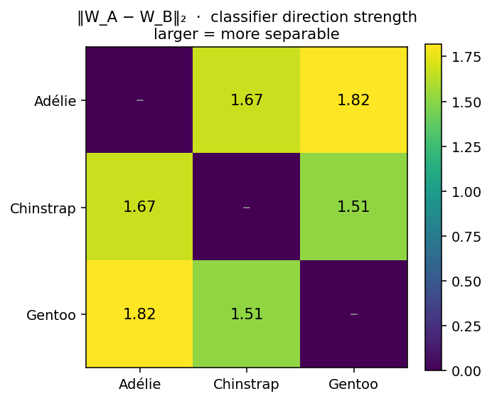
The L2 norm of the direction vector WA − WB is a rough measure of how hard the classifier had to work to tell two species apart. Adélie and Gentoo have the largest gap. Chinstrap and Gentoo have the smallest. This matches the UMAP picture from the DINOv2 tab.
2 · Per-image attribution heatmaps
Each image has three panels. The original, "why this is A and not B", and "why this is A and not C". The five examples per species are the most confidently classified ones. These are clean cases where the model strongly committed to the prediction.
- Step through the five images for one species.
- Look at where the red regions land in each "vs" panel.
- Notice whether red sits on the bird or on the background.
Adélie
Chinstrap
Gentoo
Regions that the model uses to support the actual species are red. Strong blue in a species A "vs B" map means that patch's features look more B-like. That is a useful clue when the prediction is borderline or the image is unusual.
3 · Removing the environment with SAM2 and DINOv2 on the bird alone
Section 1 suggested the classifier was using snow, ocean, and rocks as part of its signal. To test that, this section removes the background before doing anything else. Then it repeats the same analysis on the isolated bird.
Even More
The pipeline has three steps.
- For each of the 1147 bounding boxes in
data/annotations.db, run SAM2.1 hiera_tiny with that bbox as the prompt to get a tight per-instance mask. - Crop the image to the lightly padded bbox and set every pixel outside the mask to white. This gives one isolated, background-free penguin per row.
- Run DINOv2 on each isolated crop, fit a fresh multinomial logistic regression on those CLS embeddings, and compute the same per-patch attribution heatmaps.
SAM2 succeeded on 1082 of the 1147 bounding boxes. The rest were too small or too near a frame edge to produce a stable mask. The per-species counts are Adélie 479, Chinstrap 259, and Gentoo 344.
What the accuracy drop tells us
The backbone, the linear head, and the 5-fold CV protocol are all the same. Only the input changes. The accuracy drop is the cost of removing environmental shortcuts.
| setting | n train | train acc | 5-fold CV acc |
|---|---|---|---|
| full image (1 vector per photo) | 300 | 1.000 | 0.913 ± 0.027 |
| isolated penguin (1 vector per bbox) | 1082 | 1.000 | 0.805 ± 0.025 |
The roughly 11-point CV drop is the part of the original model's accuracy that came from background context rather than from the bird.
Even More
The two rows are not strictly comparable. The isolated dataset has about 3.6 times more training examples, more class imbalance, and a tighter visual distribution. Even so, the direction of the gap is the main point.
Isolated-penguin direction strengths
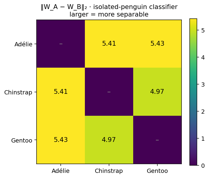
This is the same ‖W_A − W_B‖₂ matrix as before, but now the classifier was trained on bird-only crops. The norms are much larger here. With the background removed, the L2 regularizer can no longer rely on a large environmental signal. It has to push harder along the smaller bird-only differences to separate the classes.
Per-image attribution for isolated penguins
Now the heatmaps can only color the bird, because there is no background left. Red focuses on the distinctive anatomy of each species. That is the white belly and dark head for Adélie, the dark cap and chinstrap line for Chinstrap, and the body silhouette and orange feet area for Gentoo. Compare this to the full-image galleries above, where red spread onto snow patches and ocean.
- Pick one species and step through its isolated gallery.
- Find the same species in the full-image galleries above.
- Compare where the red lands in each version.
Adélie · isolated
Chinstrap · isolated
Gentoo · isolated
When a classifier has access to the environment, it will use the environment. The bird-only experiment is closer to what most people think their model is doing. The first analysis asks what the model uses. The second asks what is actually in the subject. Both are honest views of the same DINOv2 features, just constrained differently.
Simple can be better
0 · The problem
We want to measure real traits from a specimen photo. Leaf area, length, and width. To get any of them in centimeters we first need the image's conversion factor, the number of pixels in one centimeter, read off a ruler in the frame. While we can build computer vision algorithms to do this, it is likely that when we run our models on wild data we will come across unseen ruler types, new specimen preparation methods, etc. So as a sanity check it would be useful to have a simple proxy for the conversion factor that would be roughly correct across any image of a herbarium specimen. What is the best way to build one?
3757 × 5000 px
3753 × 5634 px
4743 × 7163 px
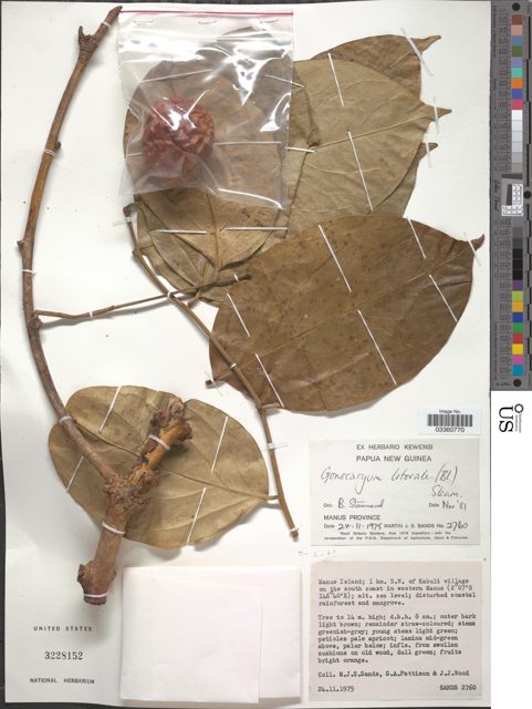
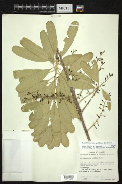
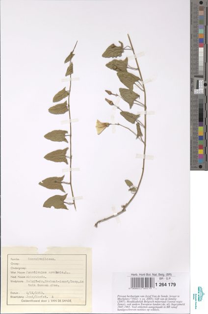
Three specimens from three herbaria (GBIF BroadSample dataset). Already we see three different resolutions and proportions. We also see three different ways the ruler, labels, and color card are arranged.



These are QC images produced by our automated computer vision pipeline. But at scale we cannot look over every image to make sure the conversion factor is correct, so we need a better method.
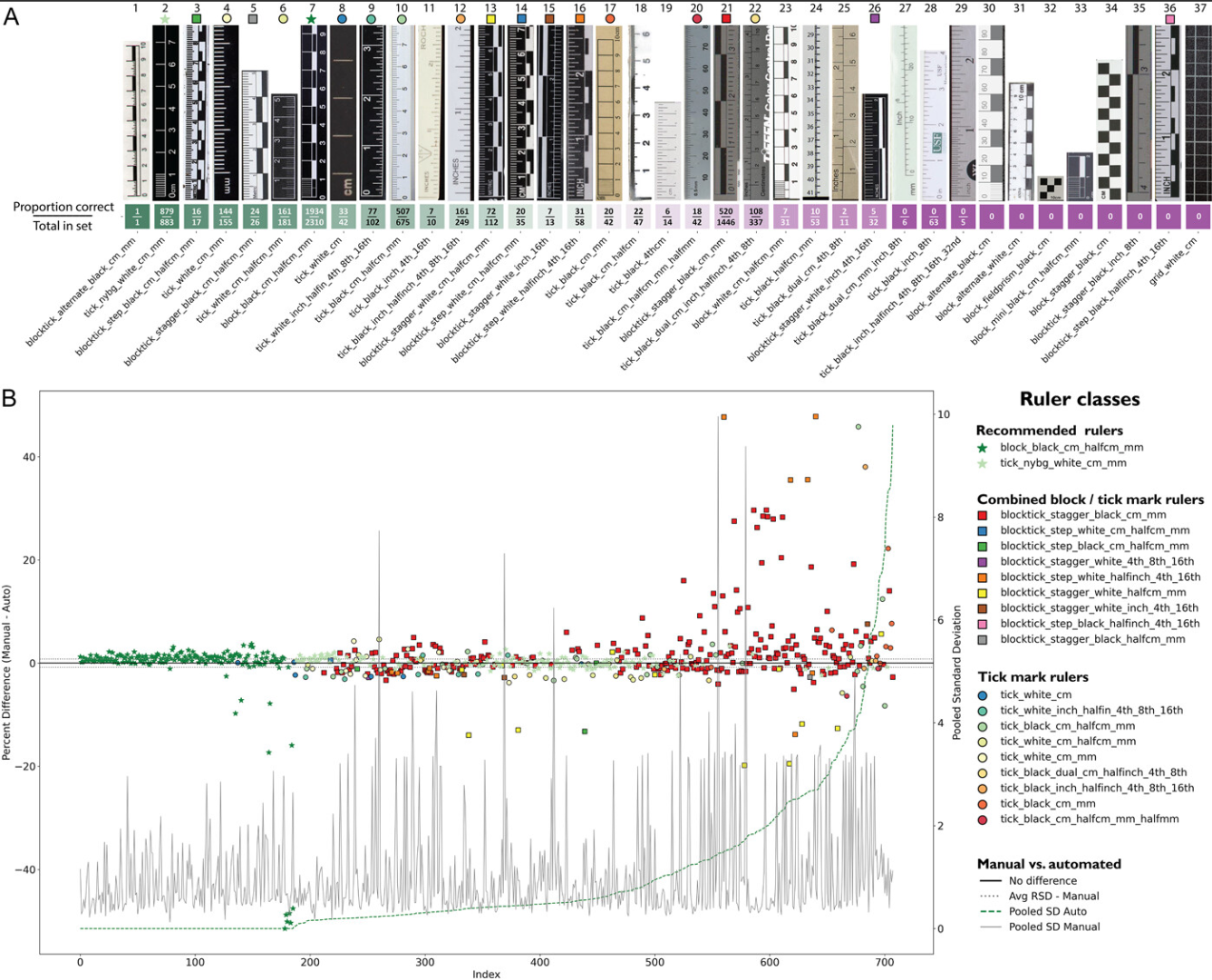
For my first attempt at a proxy I figured it would be a good idea to use all the information we have. We know the herbarium where the image was produced, we know the image resolution and aspect ratio, and I had generated a few hundred ground-truth points. So why not try something like a random forest model?
I trained a random forest in two ways: one where we provide the herbarium identifier, and one where we hide it to simulate an image with unknown provenance. Everything below runs on the real data, specimens where a ruler was hand-annotated for ground truth. The ground-truth conversion is the human-measured pixels-per-cm from ruler_manual.csv. Image dimensions come from the LeafMachine2 ruler export. Points are colored by herbarium code throughout.
1 · The data we have
One row per specimen, all the data we could use.
A few real rows
Herbarium codes (color key for every plot below)
2 · Attempt 1. Train a random forest to predict the conversion factor
The conversion factor is a continuous number, so the natural tool is a random-forest regressor. It predicts a real px/cm value with no binning. I gave it the cheap inputs from above, image width (x), height (y), aspect ratio, and herbarium code. A random forest grows many decision trees, each on a bootstrapped set of rows and a random subset of features, then averages their answers into one number.
I precomputed the forest's prediction across the whole size range. The plot shares its axes with the simple model below, megapixels across the bottom and conversion factor up the side, with the real specimens colored by herbarium code. Watch the forest's prediction path. It is a jagged staircase that flattens at both edges because the model cannot guess past the sizes it was trained on. A single straight line runs right through the middle of the cloud.
- Move the width and height sliders to dial in an image.
- Pick a herbarium from the list.
- Watch how the forest's staircase prediction changes and compare it to the straight line.
x = megapixels, y = conversion factor (px/cm). The staircase is the random-forest prediction as image width varies at the chosen height and herbarium. The ● is its prediction for your dialed-in image. Selecting a herbarium highlights its points. UNKNOWN is a forest that never sees the herbarium code.
3 · Attempt 2. Is simple better?
Before reaching for a forest, the first move is to look. Put the ground-truth conversion factor on the y-axis and megapixels on the x-axis. Then the answer appears. It is almost a straight line. One feature, one linear regression.
x = megapixels, y = ground-truth conversion factor (px/cm). Dots colored by herbarium code.
4 · The lesson
The random forest was not a good solution for our task. On a familiar image it is a little more accurate, but most of that win is memorization of our rather small training dataset. The linear predictor, by contrast, is a simple slope and an intercept. It keeps working at any image size instead of flattening into a staircase. We can even measure expected error rates in a reasonable way. It took one feature and no tuning. Simple is often better!